Is The Hillary Campaign Logo A Secret Symbol?
When the Hillary 2016 campaign logo was released, I was quick to analyze it with my conspiratorial brain.

All good conspiracies are built on clues. That’s how you know they’re real. Just like the truth about 9/11 is hidden in American currency, and evidence of government involvement in Sandy Hook can be attributed to the clever re-use of specific crisis actors, we know that if something fishy is going on, the people behind it will most certainly offer some kind of wink in the direction of theorists.
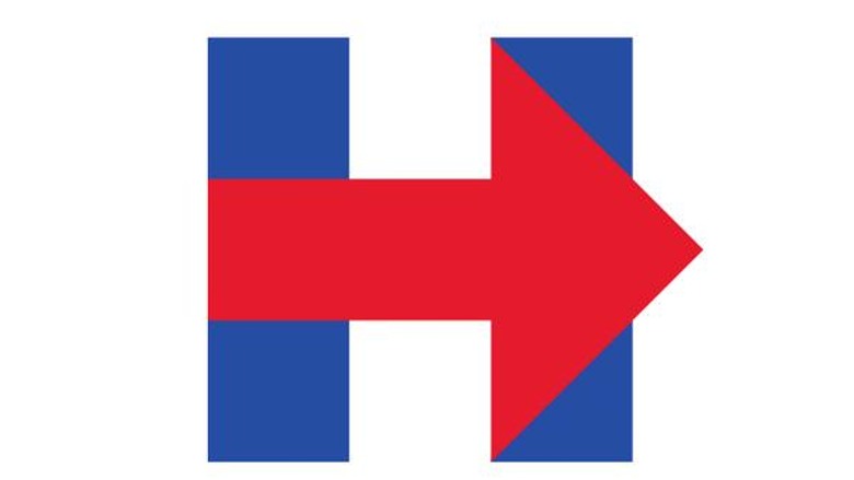
So when the Hillary 2016 campaign logo was released, I was quick to analyze it with my conspiratorial brain. Here it is:

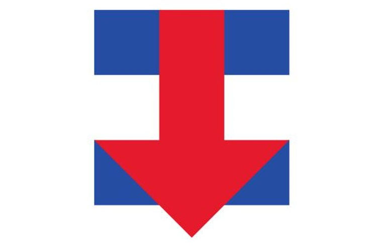
Seems as if it’s just a garbage logo, huh? It can’t be that simple. There’s no way they hired a graphic designer and the best they could come up with was, “uh, how bout like an H, for Hillary, and an arrow, which stands for forward?” No, there’s more going on here. Let’s go ahead and rotate it 90 degrees.

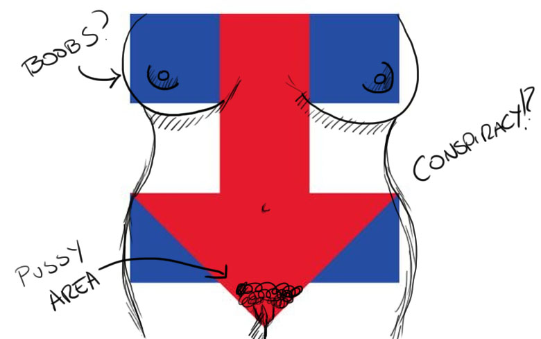
Ah, now the truth comes out! Notice anything? Suddenly the arrow no longer represents progress, but gender! The Hillary Campaign logo is nothing more than a woman’s body.

This very clever subliminal messaging is a way for Hillary to let you know that she’s the woman candidate who will become woman president, and that’s why we should vote for her, because she’s the woman. ![]()


