These Countries Redefined Controversial Beauty Ads, And The Results Are So Eye-Opening
Regardless of region, area, culture, heritage, skin color, size, or even the amount of clothing one wears, these artists show that true beauty is confidence—in your sexuality, and in yourself.
It’s no secret that there are unrealistic expectations when it comes to beauty advertising and social media. Hop on Instagram and you’ll see multiple influencers promoting products using body image, sexuality, Photoshop, and curated feeds. Billboards, internet, ads, magazines, commercials—you name it—there is a wealth of hypersexuality and images (especially of women) that are, frankly, unrealistic.
But this company decided to fight back. In a recent study, Superdrug Online Doctor asked artists from countries all over the world to re-imagine some of the most controversial, sexually explicit ads in order to empower women.
From showing different aspects of culture and heritage to changing the way the models were dressed or posed, these are the illustrations they created, and the eye-opening truths about today’s beauty standards.
Less isn’t always more.
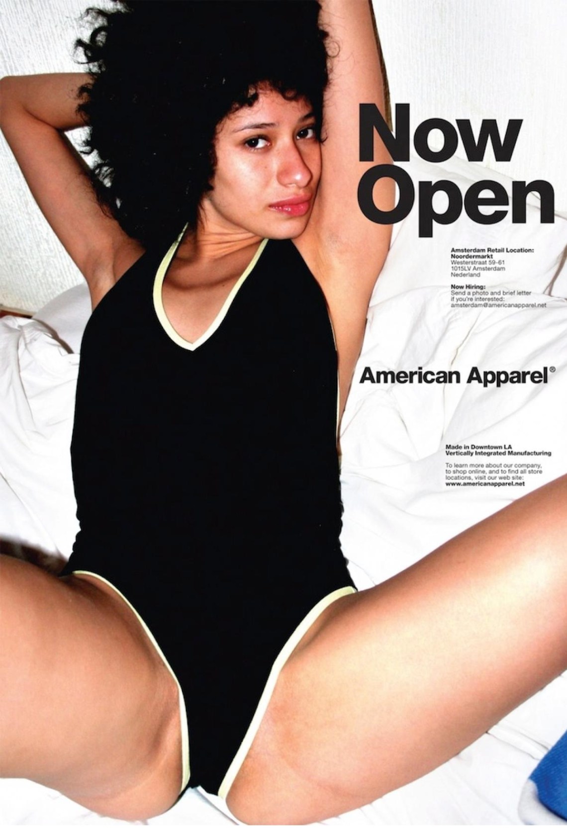
This is the original ad for American Apparel, showcasing a woman in minimal clothing, posed with a (pretty suggestive) caption.
And these are a few of the artists’ adaptations, by country:
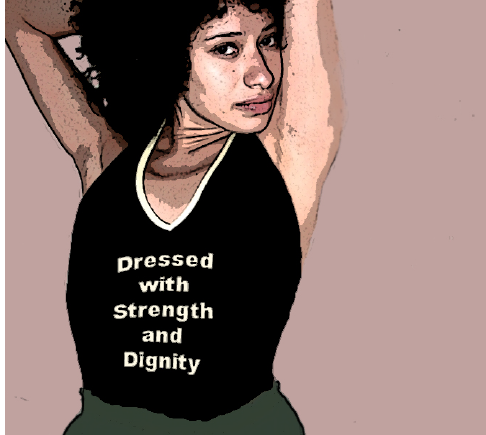
Greece:
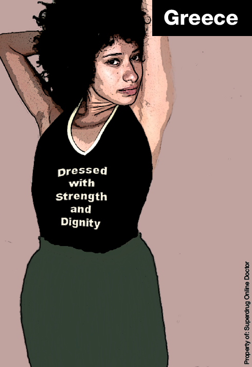
The first noticeable difference is that this artist recreated the model to be wearing clothes. She’s also sporting a t-shirt that says, “Dressed with strength and dignity,” which gives an empowering message, rather than a sexualized one. The model in the illustration also has natural, blemished skin, showing her imperfect, beautiful humanness.
Ukraine:
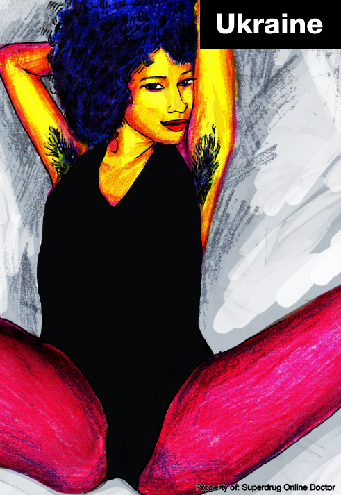
In this illustration, the model is wearing leggings to remove some of the suggestiveness from the design. The pose is the same as the original advertisement, but in this version, she has body hair.
The artist shared why she chose to leave the model in the same open-legged position, “There’s nothing wrong with sex, and we all determine what sexy looks like for ourselves.” And that idea of self-definition is incredibly empowering.
U.K.
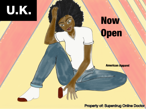
In this illustration, the artist used the same slogan, ‘Now Open,’ but with a more casual, fully-clothed, laid-back model which changes the entire dynamic of the ad from something suggestive to something that showcases the everyday woman and the clothing store as opposed to just the objectified model.
We define our own ‘beautiful.’
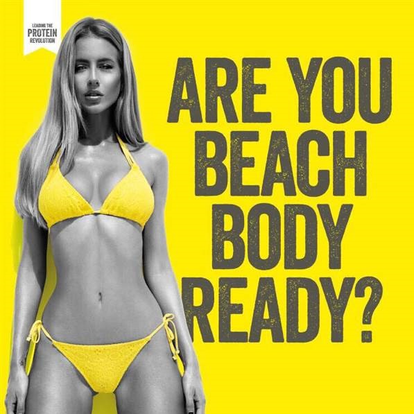
In this original ad Protein World ad, the focus is on a model surrounded by bright colors and sporting a bold bikini.
And these are a few of the artists’ redefined images, by country.
Mexico:
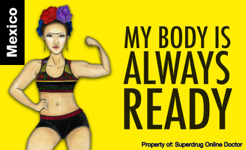
This artist recreated Frida Kahlo to speak to their culture. She’s surrounded by the same bright colors, but is wearing a ‘tankini,’ has curves and muscles, and is standing in an empowering stance next to the words, “My body is always ready.” This pushes back against the ‘beach-ready’ idea and encourages women to love their bodies and define their ‘readiness’ on their own terms.
Peru:
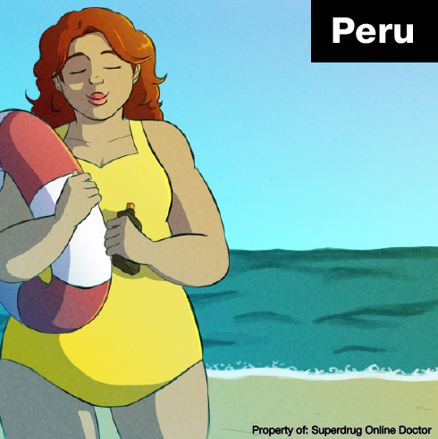
This artist changed the image completely, creating a plus-sized model with beautiful curves and a content face. She’s in the same bright yellow, but this swimsuit is one-piece and she’s standing in the foreground with the beach in the back. Though more subtle, and without any words, this illustration creates empowerment for women of all sizes and shapes.
Ukraine:
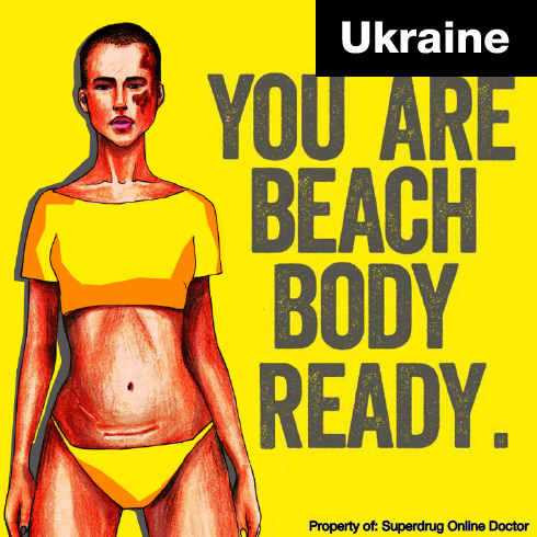
This artist created a model with short hair, a face tattoo, and a cesarean scar, showing that beauty does not have one set definition, and does not adhere to social norms.
Russia:
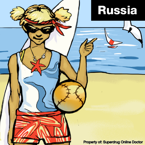
This artist created a model who enjoys outdoor activities—not just fixated on the sexualized body image.
Venezuela:
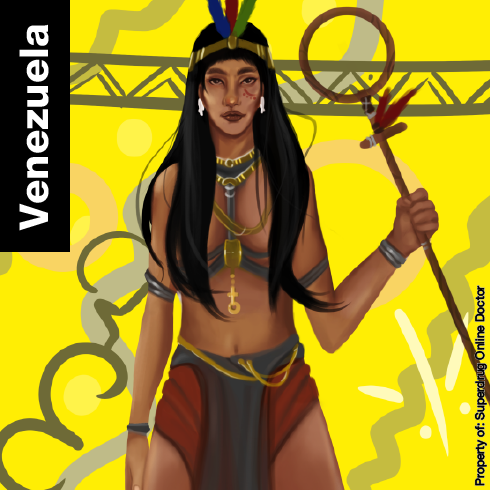
The artist recreated the image to be of the folklore goddess, Yara, to create a better representation of the culture.
We are beings, not objects.
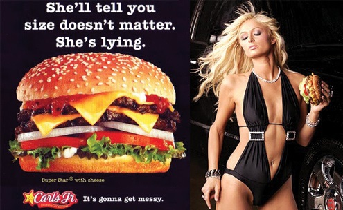
This is the original Carl’s Jr. ad, showing a woman in a suggestive swimsuit, holding a cheeseburger, and standing next to a sexualized comment.
Ukraine:
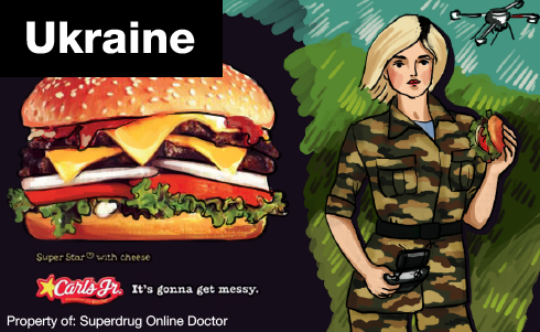
This Ukrainian artist recreated the image with a new slogan, “It’s gonna get messy,” instead of the suggestive one. She also has a woman dressed in military uniform, standing proudly, which gives an impression of power and strength and pushes back against female stereotypes.
Brazil:
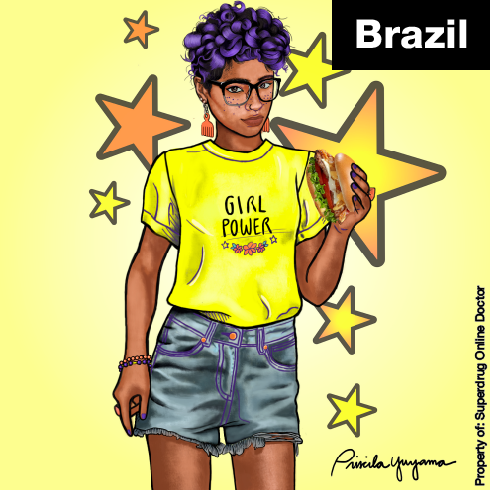
In this image, the model is wearing a comfortable outfit with a shirt that says, “Girl Power.” Instead of the hypersexualized original, this image gives off an inspiring, strengthening vibe.
Philippines:
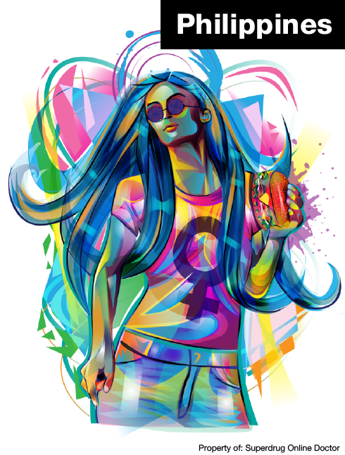
This artist used a blend of bold colors to create a woman that looks determined and confident. She’s holding the cheeseburger, sporting a feminist shirt, and is wearing clothes, as opposed to the original swimsuit.
Greece:
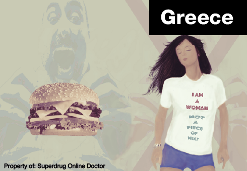
In this illustration, the hardly-clothed model has been swapped for one wearing shorts and a t-shirt. The background shows the shadow of a man looking to eat the cheeseburger, but the caption on the model’s t-shirt says, “I am a woman, not a piece of meat,” which fights back against the objectification of the original ad.
I love these images. These artists took controversial, hypersexualized, and sexist advertisements and recreated them, in their own ways, to represent true beauty.
Regardless of region, area, culture, heritage, skin color, size, or even the amount of clothing one wears, these artists show that true beauty is confidence—in your sexuality, and in yourself. ![]()
To read more/see the full study, click here.
