A Letter To AirBnB’s CEO, With Love From Georgia O’Keeffe

Dear Brian,
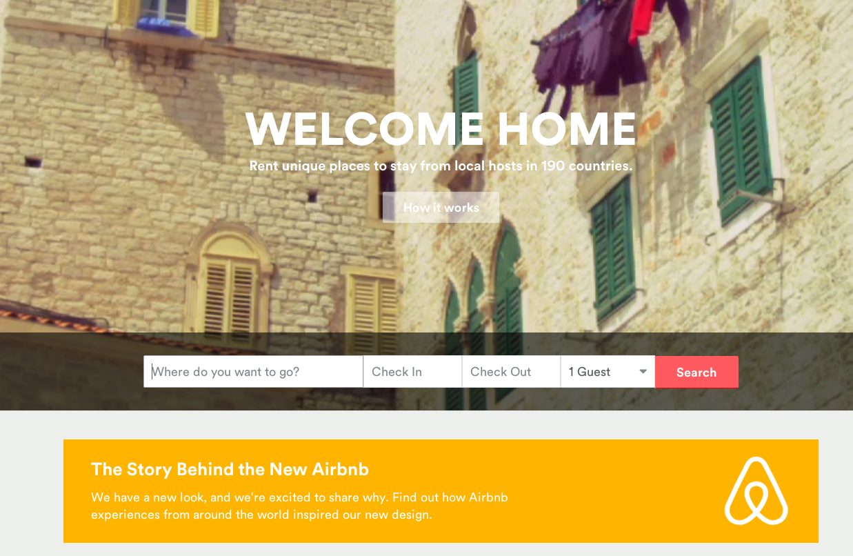
I don’t very much enjoy looking at logos in general. I know too much about them. I take them apart and see the curves and shapes, the essence for what they are, not the emblems that are imbued with their sexualized similarities. I like your use of Belo. The upturned heart, as some have said it looks like, which reminds us that we’ll eventually find ourselves in the right place again.
I understand B., running a business, much like running a life, with the intent to create, is one of abstraction. The operations of this “share economy” go on without you once you’ve employed your men and women, but the essence of the body – corporal or incorporated – lives on. The shared economy is also, indeed, the shared experience and beyond any “Vagina Logo Buzz,” to create one’s world in any of the arts takes courage. It’s also an imitation of life built from the depictions before you.
Do not bristle at the sounds of the “Vagina Logo Buzz”; a logo is a fragment of things because it seems to make its statement, as well as, or better than the whole could. How could you have depicted the conglomerate of hosts and houses that open its doors to the pioneers, the hoodied and coding, those on a sex-capade, the ones that will make toast in your kitchen and use all your jam and ask for your Wi-Fi code?
What would be the essence of the home but the womb, as one Internet newspaper man who covers technologies wrote, “After all, [your] new logo is all about ‘belonging.’ And a mother’s womb is the ultimate symbol of a safe, warm, and welcoming place.”
Searching for the macro symbol of your greater and most hospitable economy was essential, for a company cannot depict the shared economy as it is, but rather as it is felt. What’s more essentialist than crafting an icon from the original home and the roots of our beginning? When a company designs “the home,” in its formal qualities, in a huge scale, one could never ignore its beauty.
At Lake George, I’d often take a flower or look at my bulbous knees in my boat and really look at them, and it was all the world for that moment. I’d like to commend your efforts in helping the wayfarers find solace, a place to rest their heads, a reminder of their gestation. You can say so much through color and shape.
I can understand your frustrations if the gadflies are harping on the implications of your rebrand. I never intended to offend or titillate my viewers either; rather I wanted to set myself a part from others. Both you and I, we are formalists at heart, providing the architecture for those to experience our work.
Most people in the city rush around so, they have no time to look at a flower, bulbous knee, your Belo or, perhaps something else? They should see it whether they want to or not.
With love,
Georgia ![]()
